Wednesday, 5 January 2011

Overview

My aim during this project was to get myself acquainted with the techniques needed to produce realistic lighting and convincing textures to enhance the theatrical element of the film.
Using Digital Tutors, I observed professionals and the tools they used in order to accomplish the material that was required. Although the subscription was expensive, I believe that it was money well spent as Christopher an I are now in a better position now than we were at the start of term.

In terms of lighting I have learnt to use Maya's render settings to my advantage as well as mastering the tools and attributes needed to create translucent objects. It is important to stress that I wanted to learn the fundamentals of both lighting and texturing as they are directly linked to one another. If your lighting is off, then your scene and its contents will suffer and the theatricality and the mood will evaporate. It is important to find an equilibrium that will augment the composition of the image and the film. The lighting and the textures tell a story all be it a subtle one. The small nuances in the textures like cracks or worn furnishings tell you something about the character.

The second reason why I wanted to learn these key areas was the fact I wanted to bolster my existing knowledge so that I could produce more varied, good quality images.
I believe that by having these skills I will be more employable when I look for work in the future. I realize now that the techniques I have obtained need not be exclusively used for animation but could branch out to other areas such as interior design and architecture.

The Exterior

I took it upon myself to apply the necessary textures to the exterior of the apartment. I built the model of the street earlier on in production and had little time and little experience to make the object look half way decent. Now, however, with the new knowledge obtained I feel confident that I can produce a good quality image using UV mapping and texturing to my advantage.


Having already created the model of the street it was just a case of realigning the Uv's on the object ready to be textured. There were a few objects within in the scene that did not need to be Planar mapped like the iron fences as well as the stair wells and window cills. These objects required simple lamberts. This object would only be lit from the street lamps below, so it was important to be economical when texturing the surfaces as may would be in shadow. I concerned myself with texturing and planar mapping the brick work on the facades facing the camera. When modelling the buildings I deleted most of the back walls as these faces would not be seen in the film.

Again I applied a checkered texture to the walls and made sure that the squares were evenly spaced on each facade. I then started to acquire some brick textures which I later manipulated in photoshop and then sharpened to get a better quality image.


I applied a bump map to the existing texture which would bring out the recesses and cracks on the exterior. This would enhance the overall appearance of the structure making it more believable and adding a certain amount of character to the building. The bump map will be hugely beneficial when lighting the scene as the light will pick out the lighter areas and you will be able to see the individual brick. It is quite amazing how a simple bump map can make a huge impact on an object.

Here are some of the later composites I created in photoshop to observe how the textures and bump maps could look in a final render. I was very happy with the results and was impressed with the model's realism. Chris was also very happy with the outcome and several tutors commented on the models saying that the images were stunning. Having learned a bit more about UV mapping and texturing I am confident I can UV all kinds of hard surfaced objects.


Tuesday, 4 January 2011

Texturing and UV mapping


I have already touched on the texturing side of things when I applied a wall texture to a plane in one of my previous posts. Now I need to expand my knowledge in this area and begin applying high resolution textures to the exterior as well as the interior set which we will be using for our film.

I decided to model a chair that would sit in the back of the room. I knew that the chair itself was going to be partially obscured by shadow. However, I knew this would be a good opportunity for me to broaden my skills and augment my existing knowledge to produce better quality work in preparation for industry. Here is an image of the chair I will be working on.


I began to model the basic shape of the chair in Maya using simple primitive cubes. Once I had blocked in the main features and created the lips in the fabric I then smoothed the image to see how the geometry worked and the mesh reacted to a smoothing node. It is important to note that the modelling phase is key. The model must be properly modelled and must have no n gons or holes which can disrupt the texture.
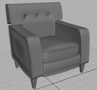
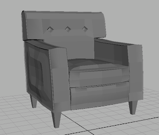


Once the modelling phase was dealt with I then began to re align the UV's. To do this I applied a checkered texture to the entire object. I then began to adjust and planar map the individual faces of the constituent pieces. I was careful to make sure that the squares lined up to corresponding facades and that they were equal all over the object. This process was very time consuming as I had to align the UV's on the finer details where the fabric overlapped. Originally I aligned the UV sets of individual faces but soon realized that I could UV all faces that were orientated to a particular axis. That is to say all the faces on the object that faced the x axis for example could be planar mapped at the same time which saved huge amounts time.

Once all the relevant pieces were UV'd I started to apply the texture to each individual facade. However, I soon realized that the fabric texture I created in photoshop could just be applied to the entire object. Once an object is planar mapped properly and if the object has one whole texture the material can be applied directly to the object. I could then use the UV texture editor to then adjust the resolution of the image using the scale tool.

I was very pleased with the final image but I suppose I was more excited that I had gained new skills which would enhance the way my work looked. Here are some of the composites which I created in photoshop which show the fabric texture applied. When I first rendered the scene I realized that certain areas, in particular the overlapping bits of fabric would appear stretched. This was easily solved by spacing out the necessary polygons which would prevent twisting when smoothed.


There are still a small amount of discrepancies regarding a certain amount of stretching, however the chair itself will be partially obscured by shadow and I can't waste too much time getting the perfect chair. I am happy with the outcome and my new found knowledge should be beneficial to the rest of the objects within this short film.


Interior Tests


The images below show the gradual progression of the apartment interior where most of the action will be taking place. This will eventually make up the final room, however, at this stage I am more interested in blocking in the key elements and creating a sufficient light source to illuminate the textures I spent a lot of time doing. This exercise was quite tricky and required a lot of trial and error. Many of the settings are heavily dependent on dials and the render settings themselves. In some cases the textures were too bright or the light sources provided too much illumination that destroyed the mood that Chris wanted. There is a fine balance in making all the elements come together. What I've learnt is there is no area which is less important than the other. Sure, lighting is a key factor but the objects as well as their textures need to compliment each-other in order for a well composited image to be produced.

You can see there are areas which still need planar mapping and UV mapping but these areas are relatively simple. For the purposes of my learning I decided to focus on the lighting and texturing aspects so I could apply these new techniques to other elements in the film.

I am confident with the new knowledge I have obtained that I can continue UV mapping many objects that appear in the film. The two images below show the Planar mapping stage that would prevent my textures from stretching. You can see the checkered material which helps hugely when aligning the UV's correctly. The second image shows a bump map experiment. This took a rather long time to render. I think this was down to the fact that the texture I applied had too high a resolution for the object and also the fact that my computer lags occasionally.

Although the texturing process is sometimes time consuming, it is well worth it when one can produce top quality images. Looking at the concepts and the models I can see many similarities, so I know I'm conforming to Chris's visions.


Lamp and Texture


Using the existing lampshade from previous tests I tried to create some simple paited wall textures that could be applied to a primitive plain. I would then apply a bump map to create an uneven surface without increasing the level of geometry. To be perfectly honest I was dreading the texturing phase as I knew very little about applying good quality textures. However, after asking several students and observing tutorials online I began to get a better understanding of how the UV texture editor function worked within maya as well as planar mapping.

Before applying a texture to the wall surface I applied a checkered material to the plane. This would act as a good way of seeing whether or not the Uv's were stretched which would cause problems when applying the high resolution texture. I then applied a planar map which would project the checkered material from a particular axis depending on the faces orientation. This should create what seems like a chess board of evenly spaced squares. This indicates that the UV's are evenly aligned. To increase the resolution of the projected texture I needed to adjust the UV's in the Uv texture editor. To increase the resolution I would use the scale tool to reduce the size of the squares. This prevents the texture from pixelating.

Now I needed to create the texture itself. Chris wanted a painted wall with a slight unevenness to it which would appear more realistic than a completely flat surface. I used a texture I obtained from an online cg site which focuses on textures and materials. I used a simple wall texture and altered it in photoshop. When I applied this texture to the plane in my scene the texture was repeated multiple times which created a tiled effect which was not the effect I was looking for. I realized that the image was too low in resolution. To solve this tiled effect I increased the size of the texture and used the clone tool in photoshop to create an uneven look. By offsetting the image I could create a texture that would not replicate itself across the wall surface. The texture would be scattered and rotated which created an uneven looking wall that looked somewhat realistic.

The texture looked adequate at best on its own but required a bump map to pick up the bumps and scratches. A painted wall is never completely flat and usually has holes and blemishes. This would add a certain amount of character and realism to the room. To produce the bump map I simply used the existing texture and adjusted its hue to obtain a black and white finish. Then I increased the contrast of the material in photoshop. A bump map is a very simple way of creating details without increasing geometry. If used well this can produce very effective images while reducing render time. The bump works by overlapping the original texture. All the darker areas appear darker creating recesses and holes while the brighter areas appear raised. Once the wall texture was projected I then applied the bump map. I was very pleased and excited at the result as it began to look more like a painted, rough wall rather than a smooth metal like surface.

Getting the UV's in the right position is key and amplifies the overall look of the object. While observing the professionals in action on various tutorials online I began to understand the texturing process. By applying the checkered material to a surface you are merely determining whether or not the Uv's are stretched. The Uv's themselves are completely separate from the material. When texturing in the future I shall try applying the checkered material to every object then planar map individual objects. Once the object is properly planar mapped and UV'd I can the begin projecting the materials created in photoshop.

More Light Tests


Having got the light levels pretty much sorted in the apartment interior I set about creating a realistic looking lamp shade that would appear partially translucent, while at the same time would emit light to the walls surrounding the room. The lamp shades in previous tests looked solid and lifeless. Using Digital Tutors I acquired some tutorials which could help me with this problem.

By using an area light I could create realistic lighting in maya. However, there were a few settings which needed to be adjusted in order for this effect to come to fruition. By adjusting the settings in mental ray I could increase the light intensity as well as the intensity of the shadows. What I really needed to focus on was the lamp shade itself. I started off by applying a simple lambert to the object then adjusted its translucency in the attribute editor as well as making the shade ever so slightly transparent in order for the light to pass through its surface.

By adjusting the lamberts translucence, translucence depth and translucent focus I could concentrate the light rays in particular areas to recreate the light emitted from a bulb. The overall result was very exciting and would give the existing scene a new sense of realism.


Initially I had problems when obtaining the light levels to sufficiently illuminate the space around the light. When rendering the shadows I noticed that they were diffused and in some cases noisy. This was not the effect I was looking for. I overcame these issues by adjusting the light sample values as well as the intensity of the area light. Eventually I acquired the look I was aiming for. The most recent image depicts the lampshade itself. I am happy with the way in which the light only partially comes through while still indicating the light source itself. I will apply what I've learnt from the tutorials and recreate this within the apartment interior.

Initial Lighting Tests

Here are some of the initial lighting tests I created in maya using simple objects and illuminated by an area light. At this point I was blocking in the key features such as the room, table and lamp shade. I didn't want to concern myself with small details at this stage as I wanted to focus on creating the lighting for the room itself. I wanted to experiment with the lighting techniques and tools to recreate moody atmospheric lighting which which conveyed the character's state of mind.


I used basic lamberts and textures to get a rough colour palette for the room. There was a lot trail and error with some of these image because of the nature of lighting and the way in which the light decays at certain distances. I found that replicating low level lighting was sometimes diificult as the viewer needs to see individual elements but at the same time the room needed some strong shadows to create a moody, foreboding atmosphere in keeping with the genre. Although the shadows seem jarring at present, the introduction of more furniture and objects should break up these hard lines. Although this process was tedious and difficult at times I gained an aweful lot just by creating these simple images. The room needed to be contrasty with shadows strewn across the floor to imply the characters emotional state. The venetian blinds in the background serve as a theatrical device. These create beams of light and symbolize the impossible situation the character finds himself in in which he cant escape. Chris and I wanted the room to be visually appealing but at the same time have a personality that would drive the story. For example, the contrast in the red wall tones to the cold blues from the environment outside convey the character's emotional struggle in the situation he finds himself in.

I am extremely happy with the current result as they replicate the mood of Chris's concept pieces. However, there is more to be done in the interior itself. More objects in the room will break up the lines and add a certain amount of character to it. At the moment the rooms feels too empty. The lamp shade is another problem area as it does not feel translucent as as lamp shade should be. This is the next area I need to focus on.

I do feel that the room itself is not saturated enough. A little smoke and light fog will help the convey a certain amount of theatrical realism to it. The character Frank does smoke so I think I believe some light diffusion will go a long way to improve the overall image.